With the BlackBerry Z10 and the BlackBerry 10 OS, the company formerly known as RIM defied the odds, critics and delays to come up with a fresh take on a smartphone platform. However, the device still left hardcore fans wanting, since it lacked the feature so typical of a BlackBerry – the QWERTY keypad. That void is now filled by the Q10 – in a way, an old-fashioned take on the modern-day smartphone. Notwithstanding the fact that it sports a relatively new OS, the Q10 is a true BlackBerry in pretty much all other aspects, and represents everything the company stands for, at least in the eyes of those who’ve used its handsets in the past. And there are hordes of them. Many have moved on to greener pastures, but many haven’t — those who aren’t comfortable typing on touchscreens. Considering there are hardly any options in the QWERTY handset segment except BlackBerry’s older models, and a few from Nokia… and none at all in the high-end space, the Q10 is a special device.
Interestingly, its nearest rival is possibly its own sibling, the Bold 9900… but that model is almost two years old and its current users would definitely be eying the Q10, not to mention those using BlackBerry’s other models who’re ready to move on. Of course, there would be many others who’re interested in a premium smartphone but cannot imagine themselves using all-touch handsets. As someone whose smartphone history includes such gems as the Nokia E61i, Nokia E70, Nokia E71, Nokia E72, the BlackBerry Bold 9780, Torch 9810, Bold 9900 and the Bold 9790, this editor can easily identify with the mental chasm one needs to cross to migrate to a full-touch handset … after having used a QWERTY to type everything from sweet nothings to official emails on a phone for a really long time. So, is the Q10 just the Z10 with a keyboard slapped on? And is it really the one to quench the thirst of those who’ve been waiting for a premium QWERTY smartphone to land? Read on and find out.
Video Review
Design and Hardware
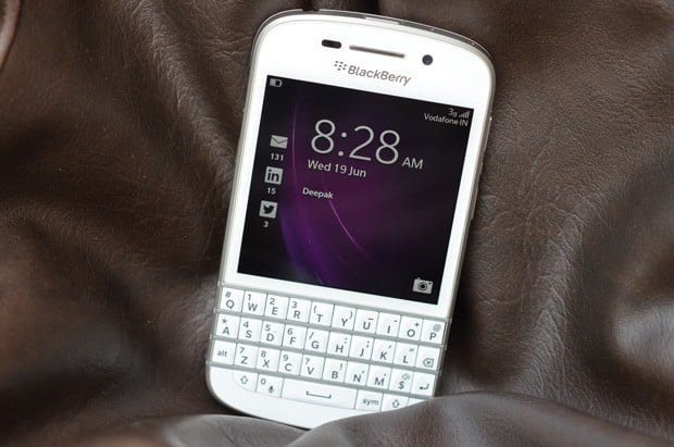
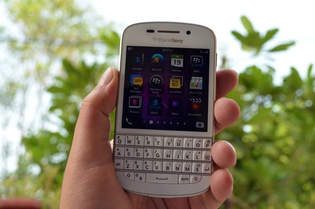
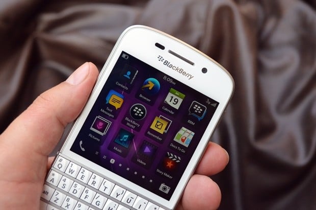
Encased in a stubby body, the Q10 sports a chassis fashioned out of cold forged steel, which we’re told, takes 20 minutes a piece to make. As with its all-touch sibling the Z10, this device comes in white or black, and at 10.4mm thick, is chubbier than the Z10. Tipping the scales at 139 grams, it’s also a tad heavier, but the extra weight is actually quite reassuring, and the phone feels solid in the hand. The fascia should be very familiar to BlackBerry users — a square screen with the keyboard below it. Right above the screen is the BlackBerry logo, and on top… the earpiece with the front camera and the sensors flanking it on both sides. Of course, it wouldn’t be a BlackBerry without its customary notification LED, and that’s placed just towards the right of the front camera, hidden from view till it blinks. The 35-key physical keypad sports large, sloping keys, with rows divided by metallic frets akin to the Bold range. However, the key rows on the latter curved slightly upwards, while the rows of keys on the Q10 are completely straight. Also, you’d be hard pressed to find any navigation key or trackpad, and there are no call accept and reject buttons either. The white of the fascia switches to silver as you move towards the spine, and back to white as it curves towards the rear.
Some design cues come straight from the handset’s other BB10 sibling. The right spine bears the volume keys with a button in the center that doubles up for play / pause and voice command functions. On the left you’ll find the microUSB port and a micro-HDMI port for TV connectivity, while the top sports the 3.5mm headset socket, the power / sleep key, and a pair of microphones for noise cancellation. The bottom is home to a large speaker grille and the phone mic. The rubberized rear of the white Q10 features the same dotted pattern we saw on the Z10. However, if you opt for the one in black, you get a carbon weave pattern that’s smooth to the touch, and is supposed to be unique to each handset. Interesting to note, but could the Q10 be one of the first devices where such differences in construction exist between two color variants? A thin strip divides the rear into two unequal parts, with the camera and LED flash placed on top left. The bottom portion is removable, and totes a BlackBerry logo in the center. Slide it downwards to reveal the removable battery along with the micro-SIM and microSD slots. Overall, the build quality is excellent — it’s every bit a premium BlackBerry as expected, and looks elegant in an understated sort of a way. Make no mistake — this is BlackBerry in its comfort zone, and judging from the end result, it’s evident that the manufacturer has taken full advantage of playing on its home turf. Rating: 8.5/10
Display
The Q10 offers a 3.1-inch window into your virtual world, and its Super AMOLED display sports a resolution of 720 x 720 pixels — that’s an aspect ratio of 1:1. In other words, this is a square screen. That goes with the territory as far as phones with physical keyboards are concerned, unless the device in question is a slider, of course. While the Q10’s 328 ppi screen is extremely crisp, doles out vibrant colors, and is quite decent both in terms of viewing angles and sunlight legibility, it’s not great for media consumption, especially videos. Since most movies have a 16:9 aspect ratio, playing them on a 1:1 screen means viewing a tiny video with almost half the screen space covered in black bands on top and bottom. And though the native browser is quite capable, the smaller screen isn’t the best for web browsing either. You also need to scroll a lot while navigating lists, such as your contact list, or the list of messages in the BlackBerry Hub. Rating: 7.5/10
Camera
Same as the Z10, the keyboard-toting Q10 also comes with an 8-megapixel main camera, while a 2-meg snapper takes on video calling responsibilities at the front. The specs for the rear camera include autofocus, back side illumination, a 5-element F2.2 lens, and video stabilization. It can do 1080p video, while the front camera is of the fixed-focus variety and can capture video in 720p.
The camera UI is the same simplistic affair as we saw on the Z10, and while it doesn’t have frills like a panorama mode or control over settings such as ISO, white balance etc, it does feature HDR and burst modes. The time shift mode is one of its highlights — snapping a series of shots even before you start capturing, allowing you to choose and save the best image later. You can choose from five built-in scene presets, and switch aspect ratios. The latter is set to 1:1 by default… a ratio native to the Q10, but you can also set it to 4:3 or 16:9 if you so desire. Again, there’s no dedicated shutter key, either hardware or software, and images or videos are captured by a tap on the screen. Image and video quality is very similar to the Z10’s output — decent as long as there’s good ambient lighting but not something to be proud of, lacking sharpness on occasion. Low light shooting isn’t its strong point, even with the HDR mode enabled.
Photo Samples
Video Samples
Rating: 6.5/10
Software
If you’ve tried out the Z10, you already know how this works… but for those who haven’t, we’ll still provide an overview. The Q10 stands on the pillars of BlackBerry 10, version 10.1 to be precise. This OS defines BlackBerry’s way forward and is characterized by a gesture-based UI that’s both intuitive as well as a refreshing change from the norm. Unlike OS versions that came before it, BB10 doesn’t require a special BlackBerry data plan for emails, BBM or web access, and a regular 3G-enabled SIM works just fine — highly useful if you’re moving over from another platform. Those switching from an older BlackBerry should also be fine, and if you’re on a corporate BES server, you can take advantage of BlackBerry Balance. This feature segregates personal and work stuff, each with a separate list of contacts, accounts and apps… with the personal side of things remaining completely inaccessible to your company’s system admin folks.
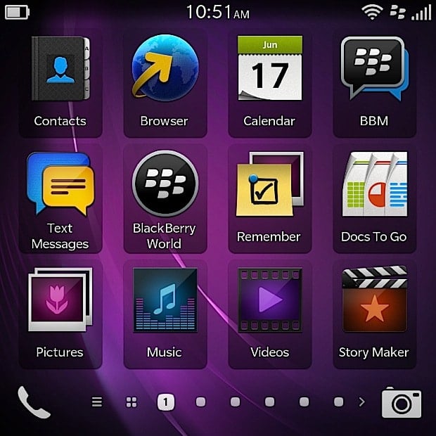
Set-up is a breeze, with the OS requiring you to sign in with your existing BlackBerry ID or create a new one, and then handholding you through setting up your myriad email and social accounts, even providing a brief tutorial to get you acquainted with the gestures. It’s done and dusted in a matter of minutes. The basic gestures include swiping down from the top of the screen to access the settings pane, and swiping up from the bottom of the screen to minimize a running app into what are called Active Frames. You can have eight of these open at any given point in time, and just need to tap on the “X” at the bottom of each to close it down. Active Frames provide additional functionality in the case of some first-party and third-party apps, such as the Calendar app displaying upcoming appointments and third-party battery apps displaying remaining juice in percentage terms, when minimized. Certain third-party apps, such as those that change the notification LED color for example, need to be running as Active Frames to work. At the center of proceedings is BlackBerry Hub, a unified inbox that aggregates all your messaging in one place — covering email, BBM, text messaging and messages from your social feeds such as Facebook, Twitter and LinkedIn. Support for these three is built right in, and the corresponding apps come preloaded. Evernote and Dropbox support is also baked into the OS, with the former integrating into BlackBerry’s Remember note-taking app, and the latter feeding your Dropbox contents straight into the File Manager. DocsToGo document editor, BlackBerry’s own Maps application, and a weather app are also included, along with the most gorgeous clock and compass apps we’ve ever seen as first-party offerings. Coming back to the main UI, you have to swipe right to access the Hub, while all apps (which can be categorized into folders by dragging and dropping, similar to iOS), are accessed by swiping left. Active Frames, if there are any running, are placed right between the Hub and the apps. You can also navigate between the various screens by tapping on the indicating dots placed at the bottom of the screen. The phone and camera apps get fixes places of pride at bottom corners of the screen, as shortcuts which can be accessed directly. The camera can also be accessed straight from the lock screen, which also displays a clock along with an indication of unread notifications. As with the Z10, this baby can also be unlocked with an upward swipe when the phone is on standby, without the need to reach up for the power key.
One of the mainstays of BB10’s UI is the Peek feature, that allows you to glance at incoming notifications without leaving the current screen. All you need to do is swipe upwards slowly, and don’t lift your finger from the screen. Indications of unread notifications and corresponding icons are displayed towards the left, and you can peek into the Hub by following the earlier action and continuing your gesture towards the right (effectively turning the gesture into an inverted L). A card stack sort of an overlay helps you check the Hub, and if you need to jump straight to it, you can do so by lifting your finger after completing your inverted L gesture. The same card stack interface makes its presence felt in native apps such as the Hub, and also other external ones that have been built to take advantage of BlackBerry’s Cascades UI. In the Hub for instance, it offers a two-pane view of configured accounts if you swipe right. You do need to get used to the various gestures, but it doesn’t take long, and once you do, you’ll inadvertently keep trying to perform similar gestures on any smartphone you handle — it’s that smooth and addictive. And if you want to master it and get acquainted with its tricks, you can refer to our guide on “How to be a BB10 power user“. Of course, some of the tips mentioned, especially those pertaining to the virtual keyboard, aren’t applicable here.
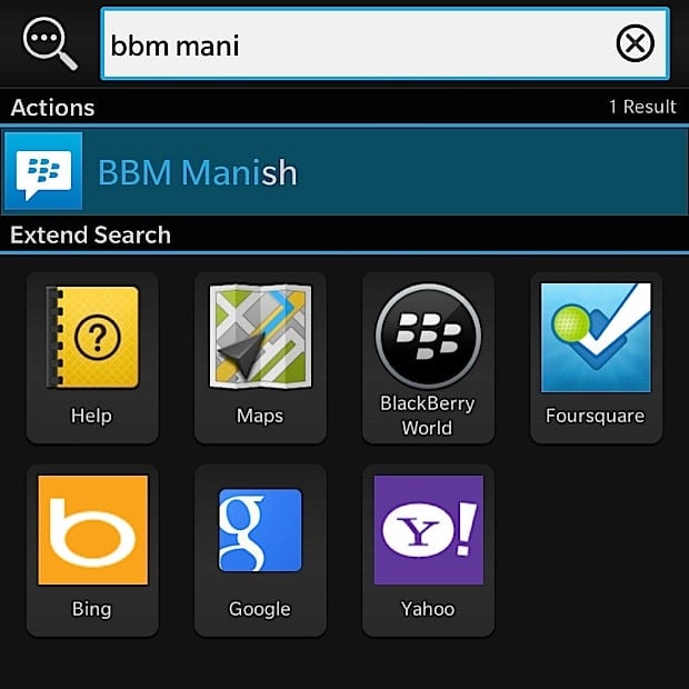
So no differences as compared to the Z10 so far, but to answer one of the questions we raised at the beginning of this review, the Q10 isn’t really the same as a Z10 with a smaller screen and a keyboard slapped on. The physical keyboard enables quite a few shortcuts and features as well. For starters, you can just start typing straight away to initiate universal search, and the device digs automatically into contacts, messages, notes, calendar entries, apps, et al. to search for what you’re hunting for. Existing BlackBerry users will also be glad to know that the keyboard shortcuts they’re used to are all supported too, including hitting the “R” key for replying to a message, “T” for jumping to the top of a list and “B” for reaching the bottom. Additionally, the keyboard also enables another new and highly useful feature called Instant Actions. This allows you to type out commands, and the screen then displays available options for you to take action on. For example, you can type “Call Raju”, and the UI will drill down to all Rajus (sorry @rajupp) in your contacts list, even extending the search to other communications from the named contact, such as emails. And then, all you need to do is tap on the desired option from the list that pops up. Other available commands include “text”, “email” and “bbm”, and you can even update your Facebook or Twitter status using this. Simple, and effective.
Of course, presence of a physical QWERTY chucks one of the Z10’s noteworthy features straight into the bin, and that’s the text prediction abilities dubbed Flow, where word suggestions appear on top of the virtual keys and can be flicked up to the text input area. There’s no Flow on the Q10 then, but you can enable word predictions, and the suggestions appear at the bottom of the screen when you’re typing. You can choose and insert a suggestion simply by tapping your finger on it. By now, you must’ve realized something else — with the Q10, there’s really no escape from getting touchy feel with the screen. While older touch-and-type BlackBerry models such as the Bold 9900 and the Bold 9790 could be operated without using their touchscreens, the Q10 can’t be used without prodding and poking its display. Not only is the BB10 platform geared towards touch-based usage, the Q10 doesn’t provide any navigation key or dedicated accept / reject keys for handling calls. It’s not a problem per se, but just something that should be kept in mind, especially if you’re completely averse to using a touchscreen. The slight niggle we have here is the unlike the Z10, the swipe-up gesture on the Q10 isn’t as convenient. Due to the proximity of the screen and the keyboard, the top of the latter gets in the way of a smooth swipe-up gesture, and sometimes results in inadvertently minimizing the running app when all one intended to do was scroll up. And vice versa.
App choice is always an issue with any new platform, and BB10 is no different. And the in the case of the Q10, the choice is further restricted since not all available are optimized (yet) for its 1:1 screen. That said, some of the core services such as Evernote and Dropbox are integrated, and BlackBerry has covered its bases by making sure that other key ones such as WhatsApp and Skype are there. Sure, quite a few of the other coveted apps, such as Instagram, Vine (which recently landed on Android after dwelling exclusively on iOS), etc are still MIA. Also, BlackBerry’s native maps hardly compare to Google’s offerings available on Android and iOS, though it redeems itself slightly (and specifically in India), with the MapmyIndia app that provides turn-by-turn voice navigation for free,. This app isn’t pre-loaded, but can be downloaded via BlackBerry World. The missing suite of Google apps, especially Gmail and maps, is definitely an issue. The ability to run ported Android apps works very well in BB10’s favor, but there are miles to go before it can come anywhere close to what the leading platforms currently offer. Of course, there’s the side load option too, but that remains a hit and a miss affair. Rating: 8.5/10
Performance and Battery life
Like the UI and some design elements, the Q10 shares its core specs with its closest sibling. Powering the proceedings is a dual-core 1.5GHz Snapdragon S4 processor, that works hand-in-glove with 2GB of RAM. There’s 16GB of storage built in, and you can cram more by inserting a memory card into the aforementioned microSD slot. Connectivity options cover everything from dual-band Wi-Fi, DLNA, A-GPS, to NFC and include the highly useful micro-HDMI port that allows hooking it up to a large-screen TV. While the phone’s own screen isn’t great for media, connecting it to a TV changes the equation drastically, while for corporate users, it translates into convenient presentation options.
Again drawing parallels with the Z10, the performance is butter-smooth and we didn’t encounter any lags or hiccups anywhere. The animations fly, while multitasking is also effortless — it seems nothing can throw a spanner in its wheels. And for a change, the Q10’s relatively smaller screen works well in its favor as far as battery life is concerned. The 2,100 mAh pack inside is rated marginally higher than the Z10, but lasts significantly longer. With one email account configured, along with Facebook, Twitter, and LinkedIn accounts, and with reasonably heavy usage consisting of 3G and Wi-Fi connectivity, WhatsApp, a few SMS messages, about an hour’s worth of voice calling and bits of music playback and playing with a few other apps, we got a comfortable day and a half from it. This is good news for users, especially executives who need to use their smartphones for heavy messaging and communications. The Q10’s QWERTY-rocking sibling, the Bold 9900 simply had one of the best physical keyboards on a mobile phone, and at the time, we thought it couldn’t be bettered. We were wrong, because the one of the Q10 is actually a shade better. This bodes well for a device that carries the tagline “The key is the keyboard”, especially considering that unlike Android, you can’t simply go ahead and install an alternative one if you don’t prefer stock. Or, in the case of all virtual keyboards in general, clamor for a firmware fix from the manufacturer to resolve any major issues with the stock offering. The Q10’s physical keyboard may not be the fastest in terms of text input as compared to virtual keyboards, but is certainly very accurate and precise. And for those who swear by physical keys, it’s a blessing. Rating: 8.5/10
Conclusion
Ouch. We’re facing a shocker of a price tag yet again. At Rs. 44,490 (~ $740 at current rates), it’s priced higher than the Z10, and also other flagships such as the HTC One and Samsung Galaxy S4, and close or higher (depending upon where you ask) than the entry-level Apple iPhone 5. If you’re in the US, the Q10 will cost you $249 if you sign up for a two-year contract with one of the carriers — a price certainly more digestible. However, if you’re looking for an unlocked unit, the high pricing isn’t good news, with things becoming hazy due to the presence of mighty rivals available in similar price bands. Even the staunchest of BlackBerry purists will balk at that outlay, and for them, waiting for the upcoming BlackBerry Q5 remains an option. The Q5 is another QWERTY-toting handset that runs BB10, and is expected to be priced more affordably. If you leave price out of the equation, there’s no doubt that the Q10 is a superb piece of gadgetry, provided you know what you’re getting, of course. If you’re considering making the move to a relatively new platform like BB10, it’d be a good idea to be aware of its capabilities, and make sure it offers what you’re specifically looking for in terms of desired apps. While this holds true for both BB10 devices… in the Q10’s case, you should also note the fact that it’s primarily a messaging and communications device, with other things such as content consumption, media, and gaming slightly relegated to the side. With that being its mainstay, it also impresses with its solid build, a highly useful physical keyboard, smooth performance, and superlative battery life. If you’re clear about this and can afford its asking price, the BlackBerry Q10 is really in a class of its own. Overall Rating: 8/10
