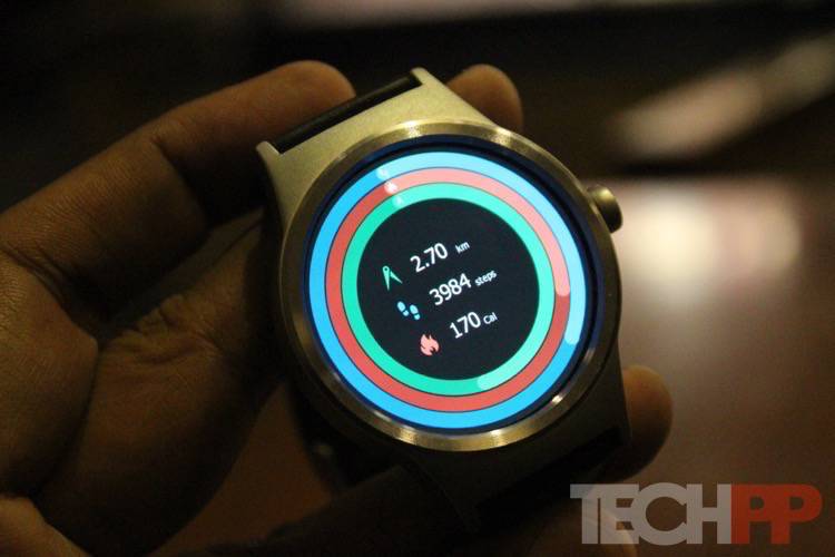
In terms of design, the Movetime aligns towards the conventional. Actually, with an appropriate watch face, it could even pass off as an analog watch. It has a round metallic body with a 1.39-inch AMOLED touchscreen display and has a ‘crown’ at the side (bang in the center of the side, not somewhere near the top as in the Apple Watch). At 1.1 cm in thickness and about 50 grams in weight, the Movetime is not trying to stand out in the crowd but blend in. We got one with a black leather band, and it was comfortable to wear and looked smart enough too. Straps can be changed – a standard 18mm watch strap can be used with the watch if need be.
In hardware terms, the TCL Movetime might seem a little underwhelming to spec hunters, especially those who have been spoiled by Android Wear. Well first things first, this is not an Android Wear smartwatch. Instead, it uses something called Free Real-Time OS (RTOS). Which is why although some will sniff at its 400 x 400 resolution display, 512 KB SOC and 16 MB RAM and 2 MB SOC and 32 GB ROM (yes, those are MB and not GB) specs, we would simply urge them to factor in the fact that this is a different OS, with different requirements. The processor is not specified, but the device comes with a heartbeat sensor, Wi-Fi, and Bluetooth connectivity – although Wi-Fi seems mainly for updating the software on the watch – and has an IP67 rating as far as water and dust-resistance goes (simple English: wear it in the rain and while working out, but do not go diving in it). The battery is a 350 mAh one, and the watch is charged wirelessly via a spherical charger.
Setting up the watch is a relatively easy process (not as easy as the Apple Watch but then nothing really is THAT simple) – pairing happens over Bluetooth, and you need the MoveTime app from the Android or iTunes App Store. In terms of usage, the Movetime hits the middle ground between a hardcore smartwatch and a more basic analog one with a few smart touches (think Timex Metropolitan). No, you won’t get a truckload of watch face options and apps (unless they come in a software update and to be fair to TCL, we got two updates in our time with the device, both of which added new watch faces), but you will get fitness information and social network notifications as well as alerts for emails, messages, and calls.
The Movetime‘s UI is basically a combination of taps and swipes. The crown serves multiple purposes – it can turn the display on and off, switch the watch off and switch it on and also takes the user back to the main watch face when you are in one of the menus. Swiping in from the right side lets you access most of the features, including access to the camera, alarm, stopwatch functions, and general settings. Swiping down lets you access three panels of basic settings in icon form (Bluetooth, Wi-Fi, brightness, volume, etc.)Swiping in from the left shows your contacts, and swiping up from below lets you see notifications. It works most of the time smoothly, although there are a few lags from time to time, and there is a bit of a learning curve, but one can get the hang of things with a little patience. And unless you are looking for a computer on your wrist, the Movetime does its job superbly, especially when you consider its price tag. The display is sharp and clear and fitness information and the heart rate sensor work just fine. Notifications are a bit of a mixed bag – the watch pulls them from the phone and has no dedicated app for each actually. If you swipe them away after seeing them the first time, they go away for good, so there’s no way of getting back to them on the watch itself. We also found that while we could view notifications, we could not actually respond to them, unless they were calls – yes, you can receive calls and make them on the watch too, although we would advise doing so only as a last resort as sound quality is not the greatest. You can read your messages in their entirety, but in other cases, you just get numbers like so many emails unread and so and so having followed you on Twitter. Some might find that restrictive but we did not have any major issues with it as messages and calls were the ones we really wanted on your smartwatches – reading loooong emails and updates on a small screen is not our style (not unless they are presented as well as on the Apple Watch).
There are also some basic gestures like taking pictures from your phone’s camera with a twist of your wrist and switching music tracks, but we did not use these much – they do work, although the camera app is slightly sluggish. The fitness and health app that comes with the watch may not be as spectacular as some others but gets the job done and we found both the heart rate sensor as well as the step counter reasonably accurate, although sometimes you had to wear the watch a little tight on the wrist to get a heart rate reading. You can see steps taken, calories burned and distance covered on display, and the watch also alerts you to get up if it finds you sitting for too long – and the alarm is a loud one. A huge plus in favor of the Movetime is its battery life. We found it easily pulling through 2-3 days on a single charge and almost four days when we worked out that we did not actually need to see notifications from social networks. Charging is fast enough – a couple of hours, and we were back to full.


